import Leanopen Lean WidgetThe user-widgets system
Proving and programming are inherently interactive tasks. Lots of mathematical objects and data structures are visual in nature. User widgets let you associate custom interactive UIs with sections of a Lean document. User widgets are rendered in the Lean infoview.
Trying it out
To try it out, type in the following code and place your cursor over the #widget command.
You can also view this manual entry in the online editor.
@[widget_module]
def helloWidget : Widget.Module where
  javascript := "
    import * as React from 'react';
    export default function(props) {
      const name = props.name || 'world'
      return React.createElement('p', {}, 'Hello ' + name + '!')
    }"
#widget helloWidget
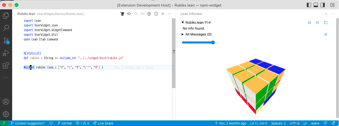
If you want to dive into a full sample right away, check out
Rubiks.
This sample uses higher-level widget components from the ProofWidgets library.
Below, we'll explain the system piece by piece.
⚠️ WARNING: All of the user widget APIs are unstable and subject to breaking changes.
Widget modules and instances
A widget module
is a valid JavaScript ESModule
that can execute in the Lean infoview.
Most widget modules export a React component
as the piece of user interface to be rendered.
To access React, the module can use import * as React from 'react'.
Our first example of a widget module is helloWidget above.
Widget modules must be registered with the @[widget_module] attribute.
A widget instance
is then the identifier of a widget module (e.g. `helloWidget)
bundled with a value for its props.
This value is passed as the argument to the React component.
In our first invocation of #widget, we set it to .null.
Try out what happens when you type in:
structure HelloWidgetProps where
  name? : Option String := none
  deriving Server.RpcEncodable
#widget helloWidget with { name? := "<your name here>" : HelloWidgetProps }
Under the hood, widget instances are associated with a range of positions in the source file.
Widget instances are stored in the infotree
in the same manner as other information about the source file
such as the type of every expression.
In our example, the #widget command stores a widget instance
with the entire line as its range.
One can think of the infotree entry as an instruction for the infoview:
"when the user places their cursor here, please render the following widget".
Querying the Lean server
💡 NOTE: The RPC system presented below does not depend on JavaScript. However, the primary use case is the web-based infoview in VSCode.
Besides enabling us to create cool client-side visualizations,
user widgets have the ability to communicate with the Lean server.
Thanks to this, they have the same metaprogramming capabilities
as custom elaborators or the tactic framework.
To see this in action, let's implement a #check command as a web input form.
This example assumes some familiarity with React.
The first thing we'll need is to create an RPC method.
Meaning "Remote Procedure Call",this is a Lean function callable from widget code
(possibly remotely over the internet).
Our method will take in the name : Name of a constant in the environment and return its type.
By convention, we represent the input data as a structure.
Since it will be sent over from JavaScript,
we need FromJson and ToJson instance.
We'll see why the position field is needed later.
structure GetTypeParams where
  /-- Name of a constant to get the type of. -/
  name : Name
  /-- Position of our widget instance in the Lean file. -/
  pos : Lsp.Position
  deriving FromJson, ToJson
After its argument structure, we define the getType method.
RPCs method execute in the RequestM monad and must return a RequestTask α
where α is the "actual" return type.
The Task is so that requests can be handled concurrently.
As a first guess, we'd use Expr as α.
However, expressions in general can be large objects
which depend on an Environment and LocalContext.
Thus we cannot directly serialize an Expr and send it to JavaScript.
Instead, there are two options:
-
One is to send a reference which points to an object residing on the server. From JavaScript's point of view, references are entirely opaque, but they can be sent back to other RPC methods for further processing.
-
The other is to pretty-print the expression and send its textual representation called
CodeWithInfos. This representation contains extra data which the infoview uses for interactivity. We take this strategy here.
RPC methods execute in the context of a file,
but not of any particular Environment,
so they don't know about the available definitions and theorems.
Thus, we need to pass in a position at which we want to use the local Environment.
This is why we store it in GetTypeParams.
The withWaitFindSnapAtPos method launches a concurrent computation
whose job is to find such an Environment for us,
in the form of a snap : Snapshot.
With this in hand, we can call MetaM procedures
to find out the type of name and pretty-print it.
open Server RequestM in
@[server_rpc_method]
def getType (params : GetTypeParams) : RequestM (RequestTask CodeWithInfos) :=
  withWaitFindSnapAtPos params.pos fun snap => do
    runTermElabM snap do
      let name ← resolveGlobalConstNoOverloadCore params.name
      let c ← try getConstInfo name
        catch _ => throwThe RequestError ⟨.invalidParams, s!"no constant named '{name}'"⟩
      Widget.ppExprTagged c.type
Using infoview components
Now that we have all we need on the server side, let's write the widget module.
By importing @leanprover/infoview, widgets can render UI components used to implement the infoview itself.
For example, the <InteractiveCode> component displays expressions
with term : type tooltips as seen in the goal view.
We will use it to implement our custom #check display.
⚠️ WARNING: Like the other widget APIs, the infoview JS API is unstable and subject to breaking changes.
The code below demonstrates useful parts of the API.
To make RPC method calls, we invoke the useRpcSession hook.
The useAsync helper packs the results of an RPC call into an AsyncState structure
which indicates whether the call has resolved successfully,
has returned an error, or is still in-flight.
Based on this we either display an InteractiveCode component with the result,
mapRpcError the error in order to turn it into a readable message,
or show a Loading.. message, respectively.
@[widget_module]
def checkWidget : Widget.Module where
  javascript := "
import * as React from 'react';
const e = React.createElement;
import { useRpcSession, InteractiveCode, useAsync, mapRpcError } from '@leanprover/infoview';

export default function(props) {
  const rs = useRpcSession()
  const [name, setName] = React.useState('getType')

  const st = useAsync(() =>
    rs.call('getType', { name, pos: props.pos }), [name, rs, props.pos])

  const type = st.state === 'resolved' ? st.value && e(InteractiveCode, {fmt: st.value})
    : st.state === 'rejected' ? e('p', null, mapRpcError(st.error).message)
    : e('p', null, 'Loading..')
  const onChange = (event) => { setName(event.target.value) }
  return e('div', null,
    e('input', { value: name, onChange }), ' : ', type)
}
"
We can now try out the widget.
#widget checkWidget

Building widget sources
While typing JavaScript inline is fine for a simple example,
for real developments we want to use packages from NPM, a proper build system, and JSX.
Thus, most actual widget sources are built with Lake and NPM.
They consist of multiple files and may import libraries which don't work as ESModules by default.
On the other hand a widget module must be a single, self-contained ESModule in the form of a string.
Readers familiar with web development may already have guessed that to obtain such a string, we need a bundler.
Two popular choices are rollup.js
and esbuild.
If we go with rollup.js, to make a widget work with the infoview we need to:
-
Set
output.formatto'es'. -
Externalize
react,react-dom,@leanprover/infoview. These libraries are already loaded by the infoview so they should not be bundled.
ProofWidgets provides a working rollup.js build configuration in
rollup.config.js.
Inserting text
Besides making RPC calls, widgets can instruct the editor to carry out certain actions.
We can insert text, copy text to the clipboard, or highlight a certain location in the document.
To do this, use the EditorContext React context.
This will return an EditorConnection
whose api field contains a number of methods that interact with the editor.
The full API can be viewed here.
@[widget_module]
def insertTextWidget : Widget.Module where
  javascript := "
import * as React from 'react';
const e = React.createElement;
import { EditorContext } from '@leanprover/infoview';

export default function(props) {
  const editorConnection = React.useContext(EditorContext)
  function onClick() {
    editorConnection.api.insertText('-- hello!!!', 'above')
  }

  return e('div', null, e('button', { value: name, onClick }, 'insert'))
}
"
#widget insertTextWidget